Vella Go GUI
2022
UI/UX Design Lead
15 Engineers
The way users configured their Velodyne sensors and accessed their diagnostics was clunky and outdated. It consisted of connecting to the sensor's IP address in a web browser which then brought the user to a series of tab-based menus with an un-intuitive layout and an aesthetic from its initial creation in 2005.
We wanted to overhaul the interface and UX, turning it into a polished Velodyne product which would also include new features, chief among them being:
The ability to visualize the point cloud output of the sensor in real time for improved user context
The means to connect multiple sensors over the internet as customer data showed many users used and configured multiple sensors at a time.

The original sensor configuration UI.
The Original UI
Our conversations began with the firmware team as they were the original creators of the interface. They had organized the menus into four tabs, each with their own “task objectives”.

UX Audit
Each menu was originally created to be broken into three areas; sensor hardware info, tasking, and real time status. However, an audit of the UI revealed it broke with these rules as you toggled through the menus. Configuration options and info were crammed tightly together, conforming to its box design and ignoring the rest of the screen real estate. The two biggest UX takeaways for improvements were:
Use all of the screen to our advantage. Give the dense information room to breathe, organize elements accordingly.
Keep information in context. Identify and centralize each category of information to reduce user confusion.

Information Blocking
I needed to account for an experience that was compatible with our entire sensor family as each model had slightly different options.
We chose to use the Velarray sensor for our v1 release as it was our most recently released sensor with high user share. My first step was to break the viewable information into blocks that were either:
Static values, info that did not change
Live values, info that changed based on sensor state
User input, values or states the user could directly change.
This categorization helped greatly in informing Vella Go’s new design layout.
Layout Decisions
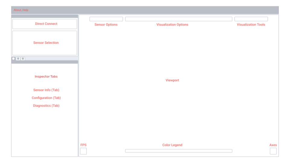
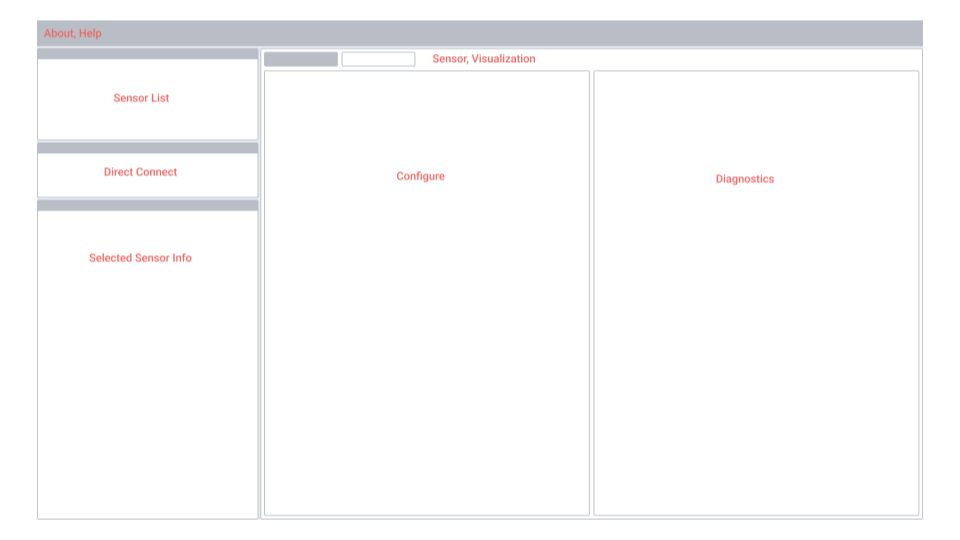
Engineers had come to me with an idea of how they thought the UI should be laid out (right). while I had my own (left). During one of our syncs I A/B’d the two layouts to point out the strengths and weaknesses of both. I named them based on our user goals:
Task-Specific (Left) Information and elements curated based on user operational areas/goals. Point cloud visualization is always present and in context
Domain-Specific (Right) Information and elements curated based on operational domain (configuration vs. visualization). Point cloud visualization requires context switch.
We ended up going with my Task-Specific layout as it reduced user burden by requiring zero context switching.
User’s configuration changes are always in context of the sensor’s output via the viewport. Any changes can be seen immediately.
Sensor options and visualization options are found on the same screen, reducing the toggle back and forth between visualization and configuration screens.
Layout model is easier to mentally map as it follows a similar layout used by many GUIs on the market (3D modeling, design/art canvases)
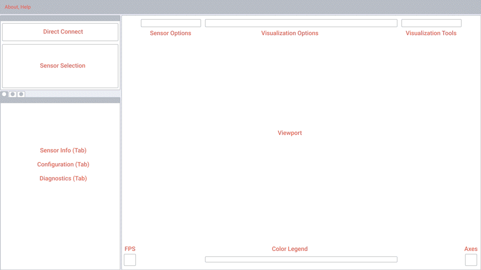
Final UI
Several UI changes had occurred by the time we arrived at the final design. Most of them dealing with the viewport and visualization options. The top horizontal layout wasn’t best suited for toggled or input values, so I converted them to a second options/editor column on the right of the screen.
Prototype
Above was shown to the lead engineer of the project and stakeholders from product, marketing, firmware, and software teams.
Context
A user wants to run and test their new lidar sensor
Flow
Connect new sensor
Review sensor info and configuration options, check diagnostics
Explore several visualization options

Outcome & Reflections
I think it met all user goals and improved the experience from its predecessor. However, it wasn’t in the hands of customers or even our engineers yet by the time of my leaving, so whether it had any impact is unknown.
My plan once it was in the hands of users, was to gather insights regarding:
User experience regarding setup - downloading Vella Go, connecting the sensor, and identifying any bottlenecks.
Determine the next suite of configuration features - we only had the most basic of configuration options for first release. There was much more to bring over from the old system, but I wanted to see if there was an overwhelming need for certain features over others.
Identify user needs for visualization options - see how users were using the visualization options and how that could inform their expansion.